Almost every day, we are bombarded with a variety of graphics and images through advertisements and online articles. In many instances, a graph is provided alongside a text or argument, in hopes of reassuring the reader that their reasoning is sound. Of course, a picture must be worth a thousand words, and the proven science contained within it is a piece of conjecture so powerful that any additional comments or scrutiny would likely just muddle its message, right? Perhaps not.
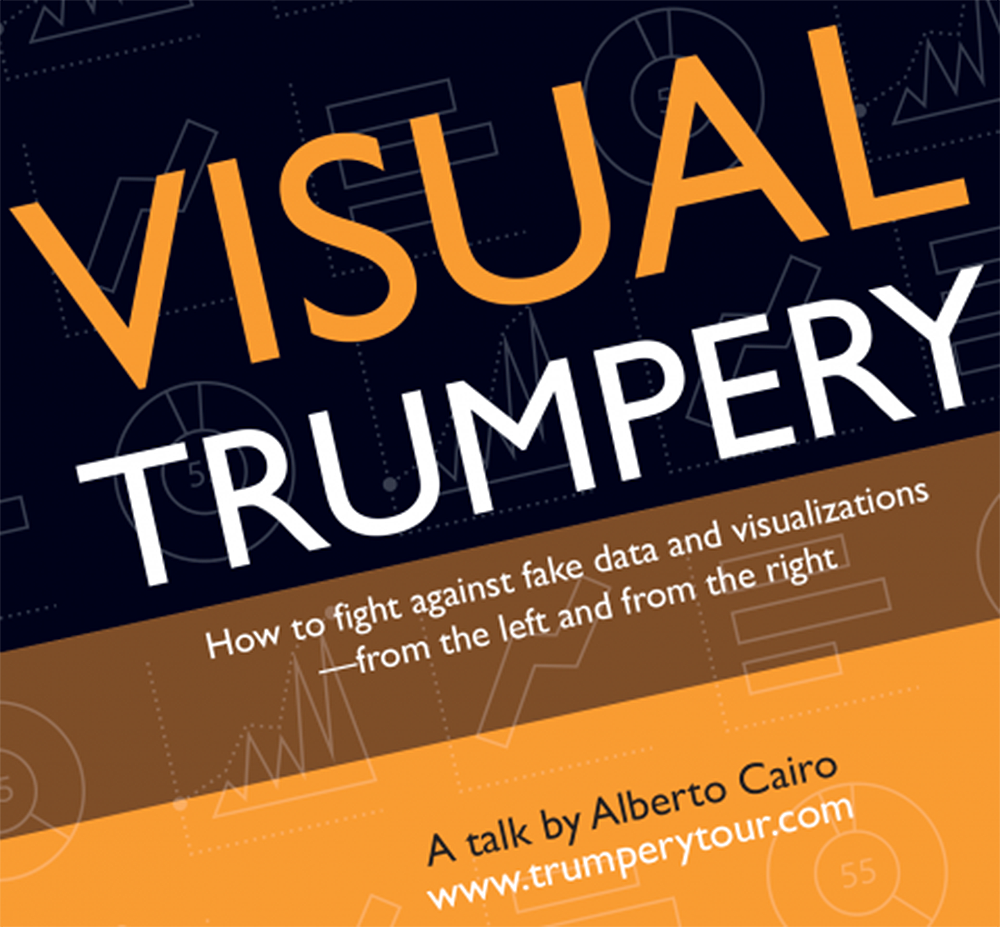
Alberto Cairo, Knight Chair in Visual Journalism at the University of Miami, came to NC State to present his lecture tour known as Visual Trumpery in Hunt Library last Tuesday, Sept. 4. Throughout his presentation, Cairo argues that using data visualization to prove a point as a means in that it is not only ineffective, but irresponsible in the pursuit of truth. In his presentation, he spoke about the misleading behaviors of hurricane tracking charts, Planned Parenthood abortion correlations, and the infamous 2016 electoral map to emphasize the need for widespread graphical literacy and a well-articulated message to accompany any data. According to Cairo, a graph is a tool, not an explanation, and its role in a truly objective conversation must still be supplemental to a clear argument.
“We have plenty of books about how to think better, about numbers, about statistics, but we don’t really have any book for the general public about how to read charts, about how to interpret them: how to infer the right meaning behind them,” Cairo said.
Additionally, the tendency to oversimplify data in visual mediums often leads to gross inaccuracies in the conclusions which are drawn from it. Cairo provided the example of a statistic used to tout 2017’s tax cut which cited average money saved per household from being over a thousand dollars. This misses the actual reality of money saved from less wealthy families due to the large breaks provided to the wealthy skewing the data. This is both particularly tantalizing and particularly dangerous in our increasingly caustic political climate, and it is imperative that we realize this issue is apolitical, and the exploitation of instantaneous communication through platforms like twitter are making it more apparent.
“This problem is not only becoming more widespread because of something like social media,” Cairo said, “but also because of our tendency to be prone to things that reconfirm what we already believe. So it’s a combination of human nature and certain technologies that enable our worst instincts.”
Students such as Anusha Tummallapalli, a first year in the Poole College of Management, attended Tuesday’s iteration of Visual Trumpery to learn how supposedly straightforward graphs and charts were actually quite malleable to the message which it accompanies.
“This is so mind-blowing,” Tummallapalli said. “This presentation really gave me an idea on how people can manipulate data to fit their own agendas. Being personally liberal, I’ve seen people online who are conservatives do this sort of thing, but now I really only see that when it fits what I’m already thinking. This has been really impactful because it’s going to change how I look at data.”
In an atmosphere that constantly spawns debate, members of both ends of the political spectrum are chomping at the bit for the next piece inarguable truth to prove that their system is superior. Cairo claims that in such situations, the tendency to find graphs proving preconceived notions is often resulting in an incorporation of graphs into arguments were are not properly verified or analyzed.
“The talk is completely apolitical,” Cairo said. “It’s a talk about how everybody misuses charts, diagrams, graphs, any visual representation of data”
Whether it is through an intentionally misleading visualization which oversimplifies, skews, or otherwise manipulates its data, or simply a graph which is too complicated to be easily understood by its reader, Cairo states the need for skepticism is crucial to a well-rounded understanding of any subject. As it was emphasized throughout Visual Trumpery, graphs are touted as academic wonders which transcend the need for verbal explanation, but creates a culture which assumes as a finality of a discussion rather than the tool to further one.