
For a college, recognition is everything. Whether it’s academic prestige or national exposure for athletics, having a strong brand undoubtedly benefits everyone at a university. Despite strong initiatives to improve the quality of NC State all-around, the school’s athletic branding has continued to be weak. NC State is allowing itself to be treated as a second-rate school in terms of branding and merchandising, and that has some unexpected impacts on the quality of its athletic programs.
Let’s start from the beginning. NC State established itself as the “Wolfpack” just under 100 years ago. The most famous logo, the “Brick S” has been in use, in various forms, since the 1890s. Red and white have been the school colors since late 1895. So, broadly speaking, the NC State brand is historically well-established.
During those 100+ years, however, NC State failed to establish standardized versions of any of its logos, uniforms or wordmarks. The Brick S has seen many revisions, as recently as 2006. The secondary “strutting wolf” and “Tuffy” logos have also been heavily modified as time has progressed.
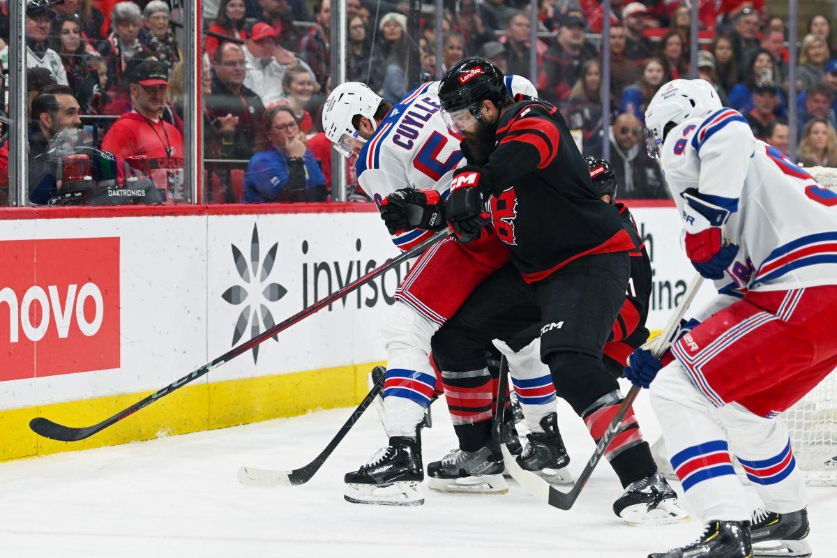
Even more of an issue is that every few years since then, NC State has drastically changed its sports uniforms. For NC State’s most nationally recognized sports, football and basketball, uniforms vary so tremendously every year to the point that there are hardly two fans who have the same version.
College uniforms usually take on two forms. The classical approach: an unadorned jersey/helmet in team colors that never changes. Texas, Notre Dame and Penn State Football are great examples of this. Then there’s the modernist approach: constantly updating the jerseys with new iterations each season, along with several different helmet styles. Think Oregon, UCLA and Boise State. These teams garner national attention with flashy and innovative style.
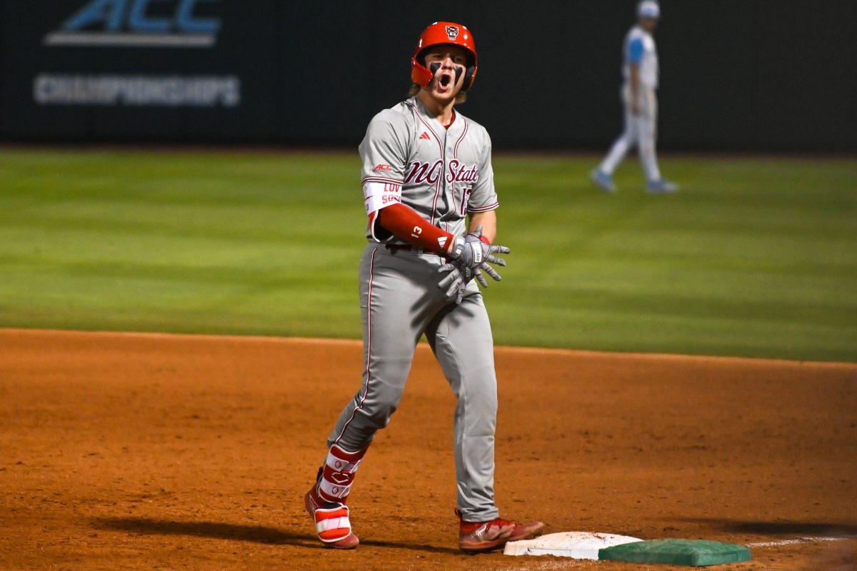
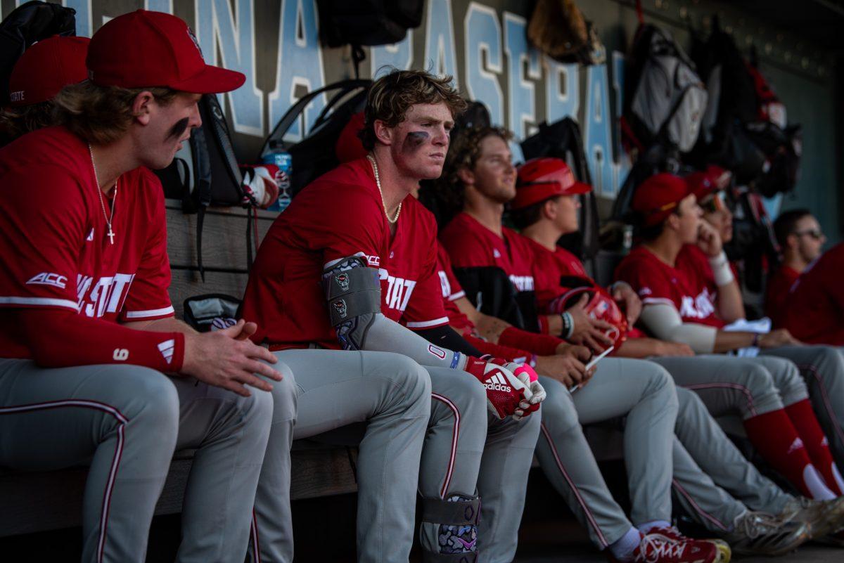
For NC State, almost every iteration looks like almost no design time was put in. Grab a red, white or gray NC State football or basketball jersey off the shelf and cover the “NC STATE” wordmark, and try to find anything unique. Then, go to a basketball or football game. Look at the fans with jerseys on, and count how many different unappealing wordmarks, stripes or collars you see on the same red or white base. NC State has not chosen either route in terms of uniforms, and Adidas will likely continue to put almost no effort into the design.
These may be minor details in the bigger picture of athletics, but they have a major impact. Outside of the Triangle, most people won’t recognize an NC State jersey. To offer a personal anecdote, my father, who has been a collegiate sports fan his entire life and can practically name every valuable player since 1970, saw the NC State logo for the first time when we toured last year. In a recent conversation with an admissions officer, I was informed that despite red and white decor and signage, students at college fairs often ask, “Is this the school Michael Jordan went to?” or confuse the logo with Stanford or even Syracuse.
This gets even worse in terms of recruiting. Why would a top-tier high school athlete want to wear a uniform that most people won’t recognize? If it weren’t for infographics, would TV viewers be able to differentiate NC State from any other red team? How can NC State expect national exposure if it can’t even put together a recognizable brand?
NC State is making huge strides toward being a nationally recognized and prestigious academic university. It’s time that the athletics programs do the same, and that can start long before players walk through the tunnel. Ultimately, a college is a business, and right now, the NC State brand is practically worthless. Standardize the logos and uniforms, or create new ones every other week. Stay classical or go wild, but do something.
Adidas has the resources to create a unique, respectable and valuable look for the athletes, and it’s high time they do so. The university itself must set aside time and effort to create a recognizable brand, or continue failing to impress. The athletics personnel and branding office need to push for better representation, and so do the fans.
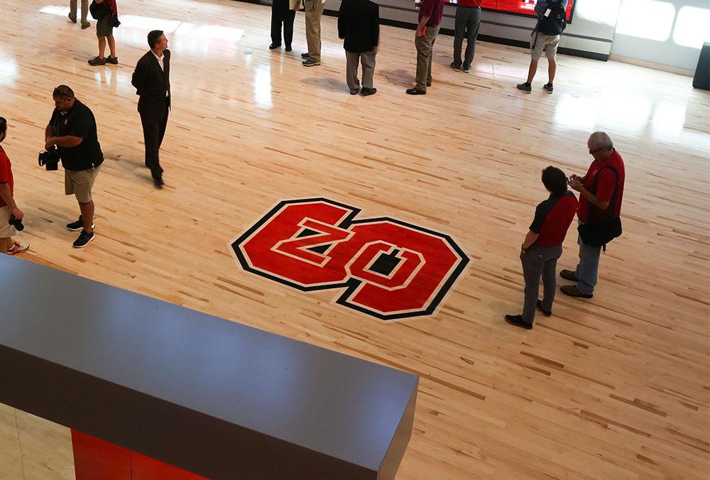
Media hover around the interactive display inside of the grand hall museum of Reynolds Coliseum on September 7th, 2016. Reynolds has completed its renovation shrinking its seating capacity but includes a new museum portion.